


Castalia Library logo poll
Help Castalia choose our new Library logo

You’ve all seen our History logo; we use it on this site. Now we’re in the process of designing our new Library logo, which will appear on the copyright page and the last page of the book interiors, and possibly, as a blind stamp on the backs. Unlike History, which is a dedicated series, the logo will not appear on all the spines.
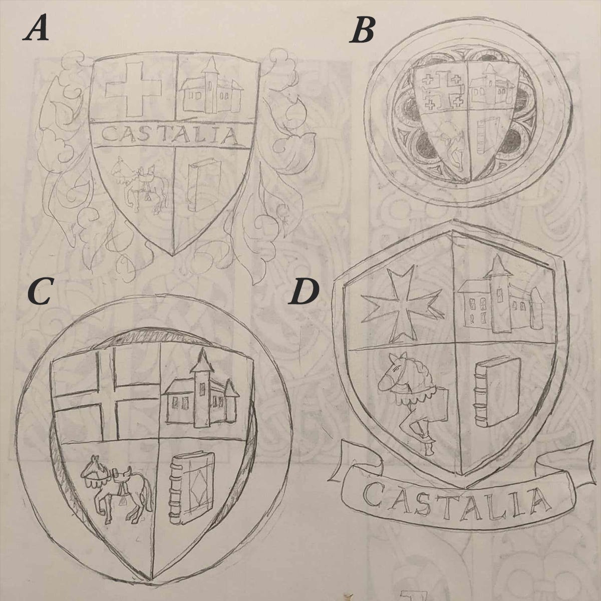
Whichever direction we go in, the logo will feature the words CASTALIA LIBRARY - or in the case of the Libraria books, LIBRARIA CASTALIA. It will also feature our Library motto: NOLITE TIMERE BONUM
D is closest to proper heraldry, with the wording under the shield. It would be better if the top of the shield were flat. Write out the blazon!
For more info, see https://www.amazon.com/Introduction-Heraldry-Peter-J-Floriani/dp/1500598984/
I prefer D, and then A.
Since the logo will appear on the book spine, I could image a simpler version of D (without the ribbon, since it'll be quite small and might be difficult to read) with the horse and castle drawn in a slightly simpler manner to capture the essence of both.